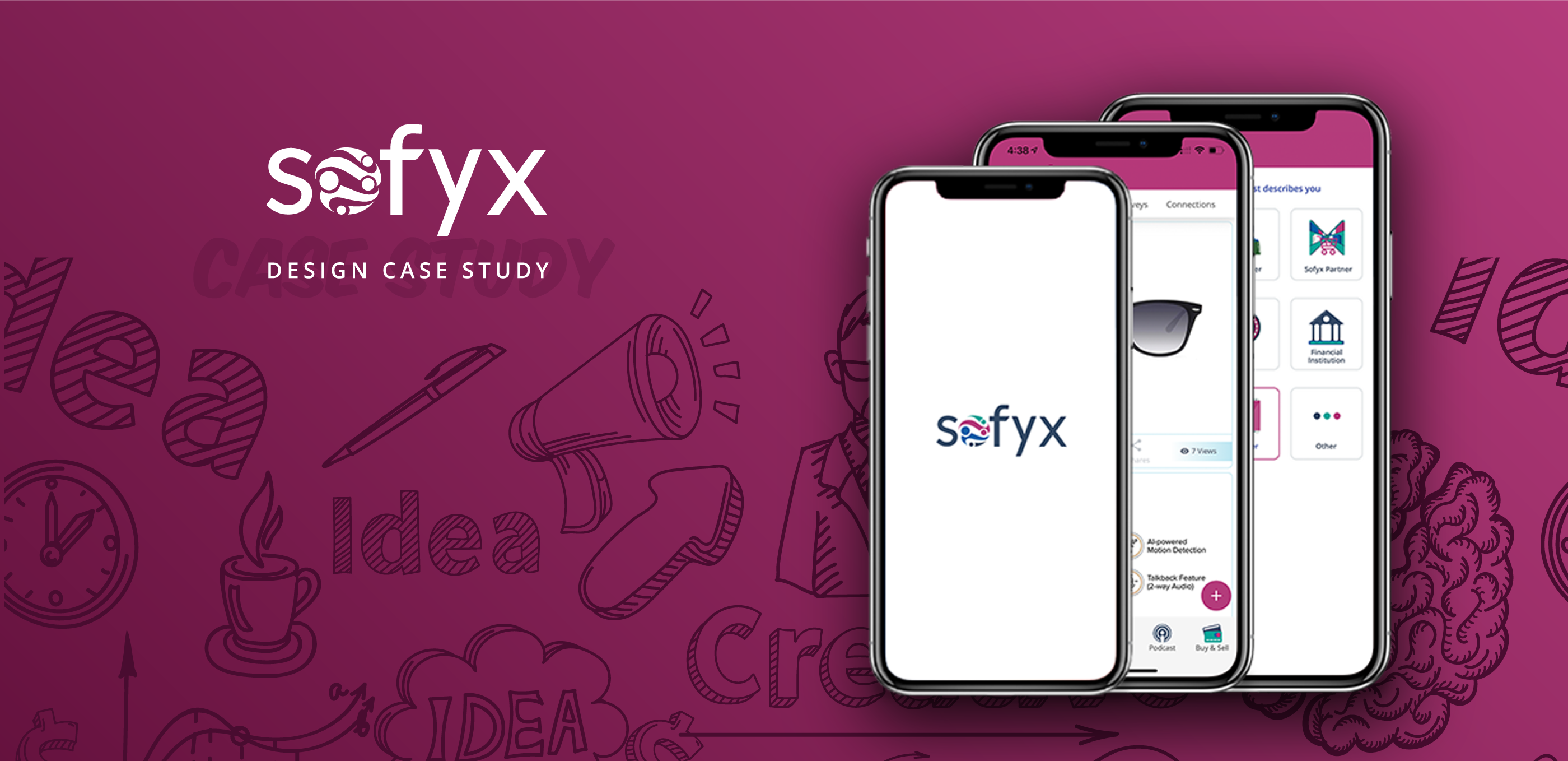
Do you remember where you bought your first smartphone?
Chances are at an unbranded store, one of the 90 percent that make up India’s $700 billion unorganised retail market, recommended by a friend or relative.
But the world has since then moved online – and so have smartphone buyers, adversely affecting the numerous retail trade stores across India. A 2018 report by Counterpoint Research says overall mobile phone shipments rose 11 percent. And while brands like Xiaomi, OnePlus, and Motorola are purely online, many people still prefer to buy their phones from the neighbourhood store.
With the smartphone business moving to online, as a result the small trade retailer’s business was getting affected and resulting in decline in store footfall and lower customer retention. To tackle this problem sofyx was introduced. Sofyx is social commerce platform focusing on general trade retailer and enabling them digitally. The idea was to help these store owners digitise, become more competitive, and create a new channel.

Sofyx as a brand is focused on enhance and bring together the general trade retail.
The circle in between the logo signifies the unity and all together connection between the company partners and thee small trade retailers and facing the challenge together.
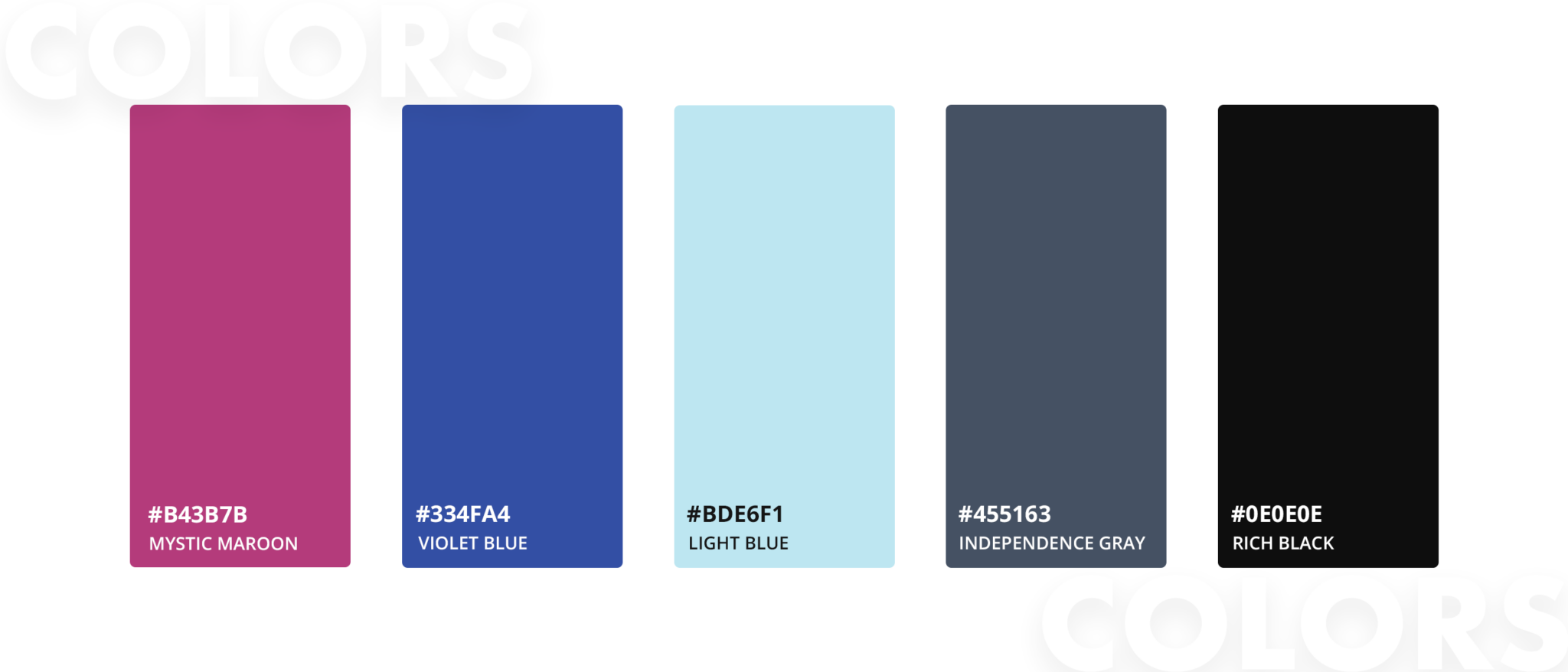
In terms of colors, instead of plain and simple, we decided go with something that’s not very commonly used in our day to day applications but also on the other hand will give a pleasant and cheerful vibe to the user.
"The magician takes the ordinary something and makes it do something extra ordinary"
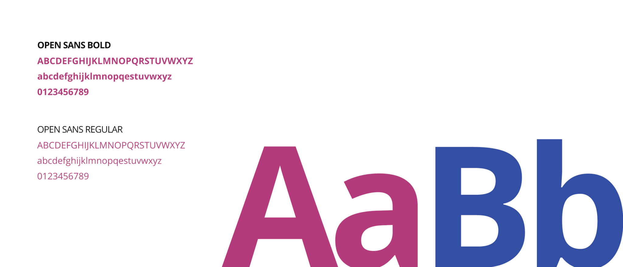
We chose OPEN SANS as our primary typeface because keeping in mind about the material content in the app, we needed something which is easier to read and don’t have much of a visual noise. Open sans is one of the best performing web fonts for body text and has very low visual noise.
We decided to go material icons for the application along with custom hand-designed icons for primary actions or hotspots.
The challenges these retailers face is that they aren’t “discoverable” on the internet. Even if a customer buys from them once, chances are s/he will go online for the second purchase. Since the traffic has moved online, the customer retention has declined, the probability of a customer who bought from the shop will return here for the next purchase is very low.
Retail stores don’t have customer management tools(CRM) or database management systems where they can target their customers specifically as the offers are limited to online platforms only.
Key problems identified for MVP:
- Customer Retention
- Communication between brands and retailers
- Access to exclusive offers
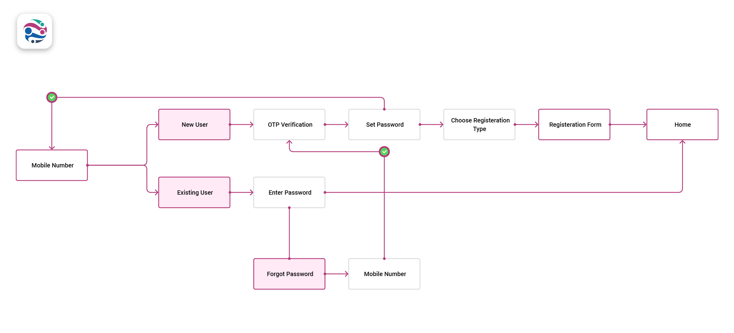
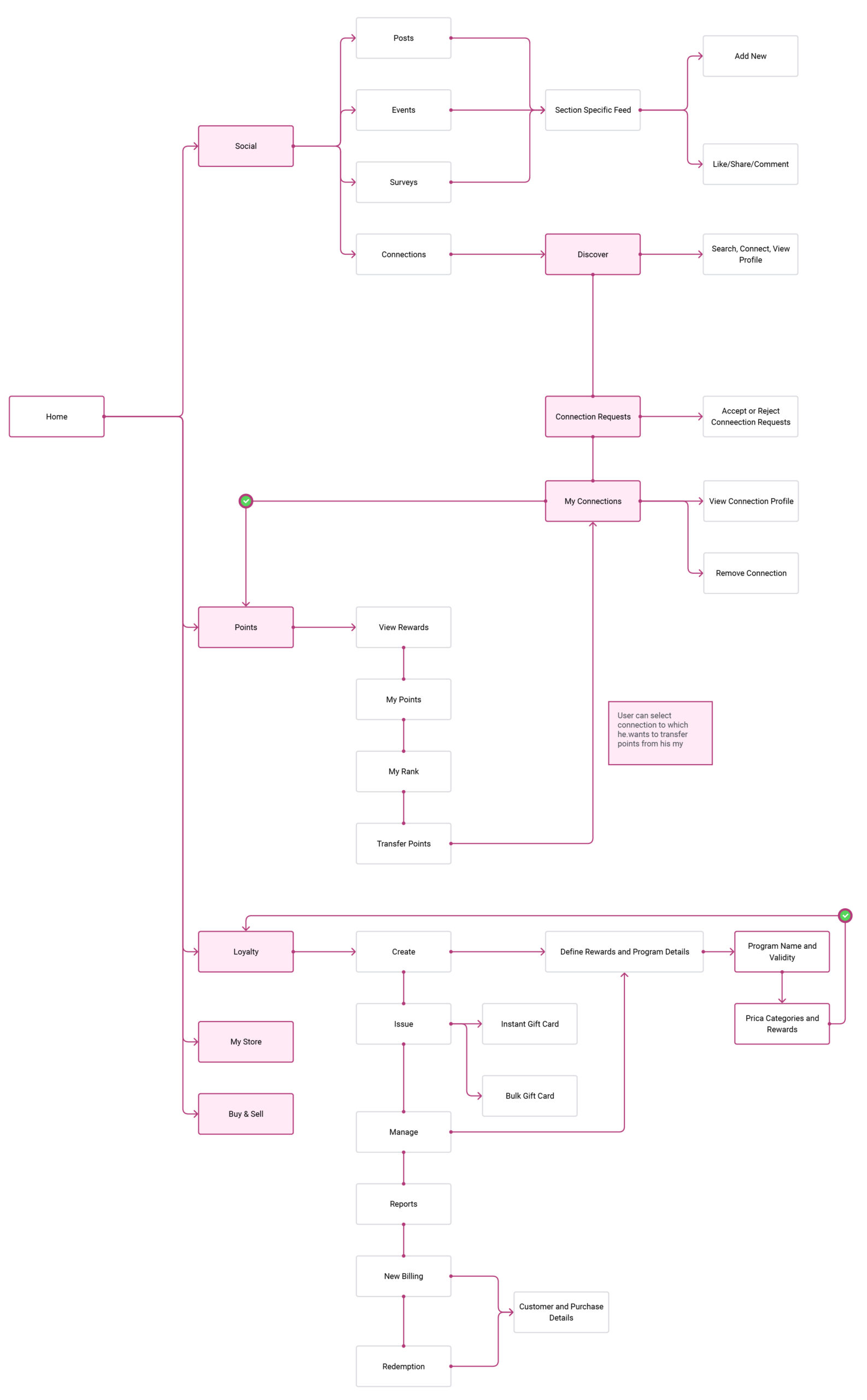
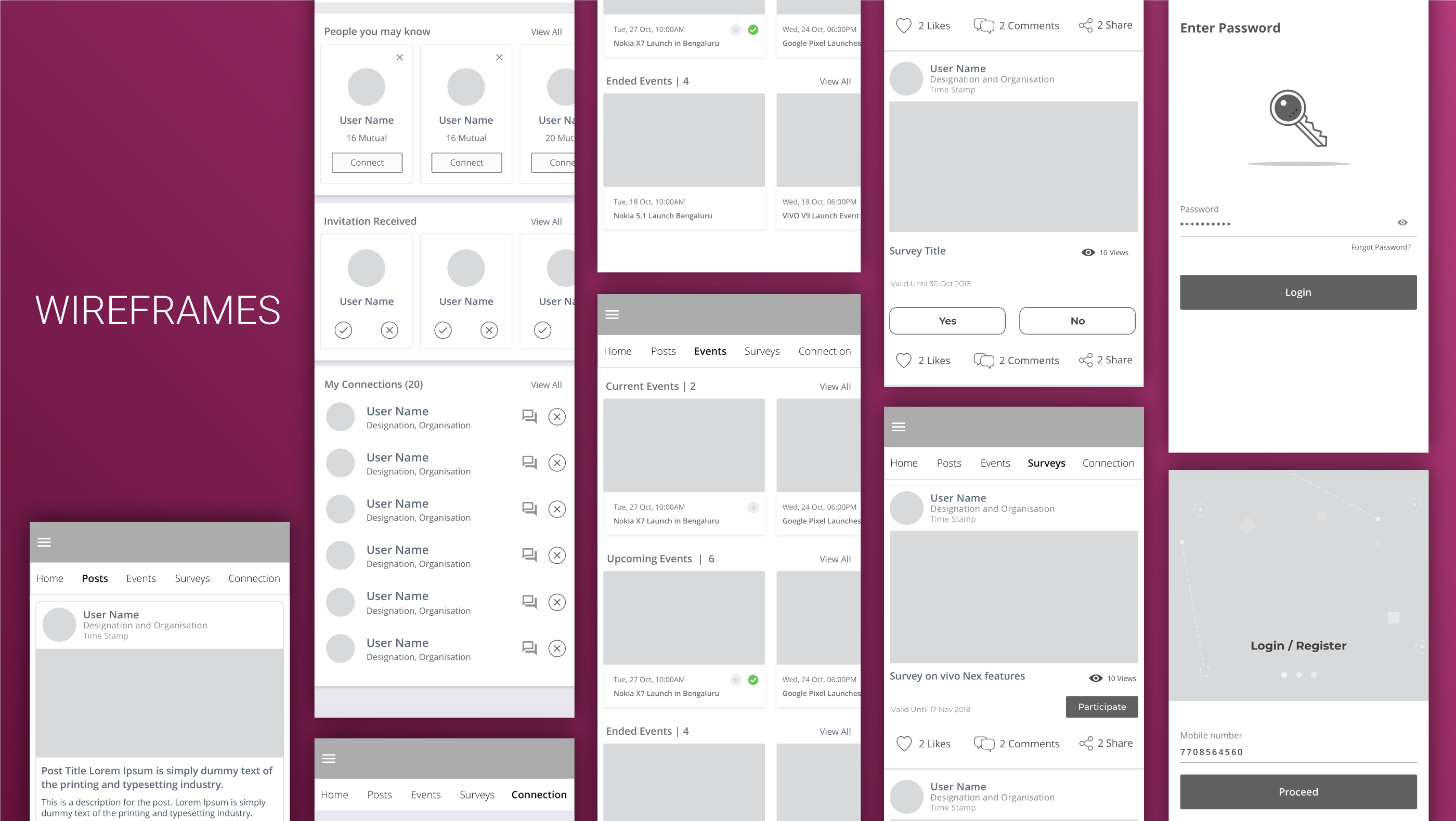
After initial research and addressing the problems faced by the small trade retailers/general trade retailers we decided to build an ecosystem where the retailer has access to everything he needs. To create a platform that makes it easy for different industry players to come onboard and plug on to the system.
Sofyx plugs in all the things that a retailer needs for digitisation. Retailer can connect with peers in the industry, can post social happenings and latest information. Thus introducing a Social element in the application
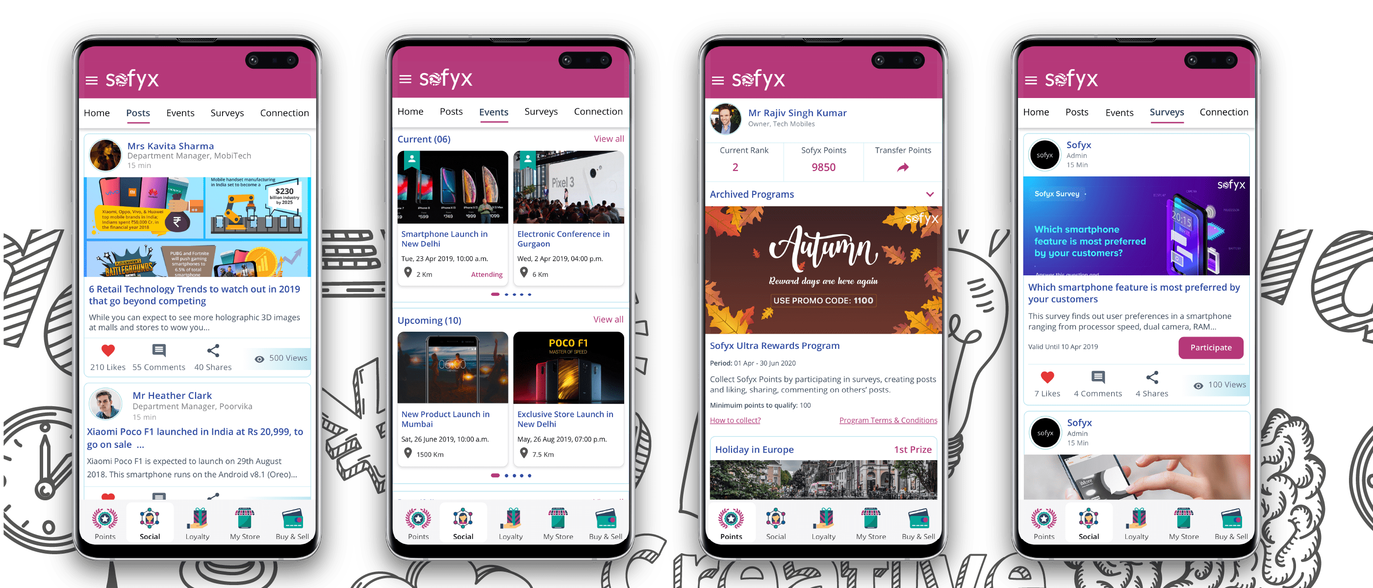
Loyalty enables the retailer to retain the customers by issuing gift cards (applicable on next purchase) and gifts to automatically trigger the next future purchase from his store, which can also result in customer referral in the future. Each transactional confirmation is tagged with a store locator link enabling user to locate the nearest store in his area, hence increasing the discoverability of the small trade retail stores
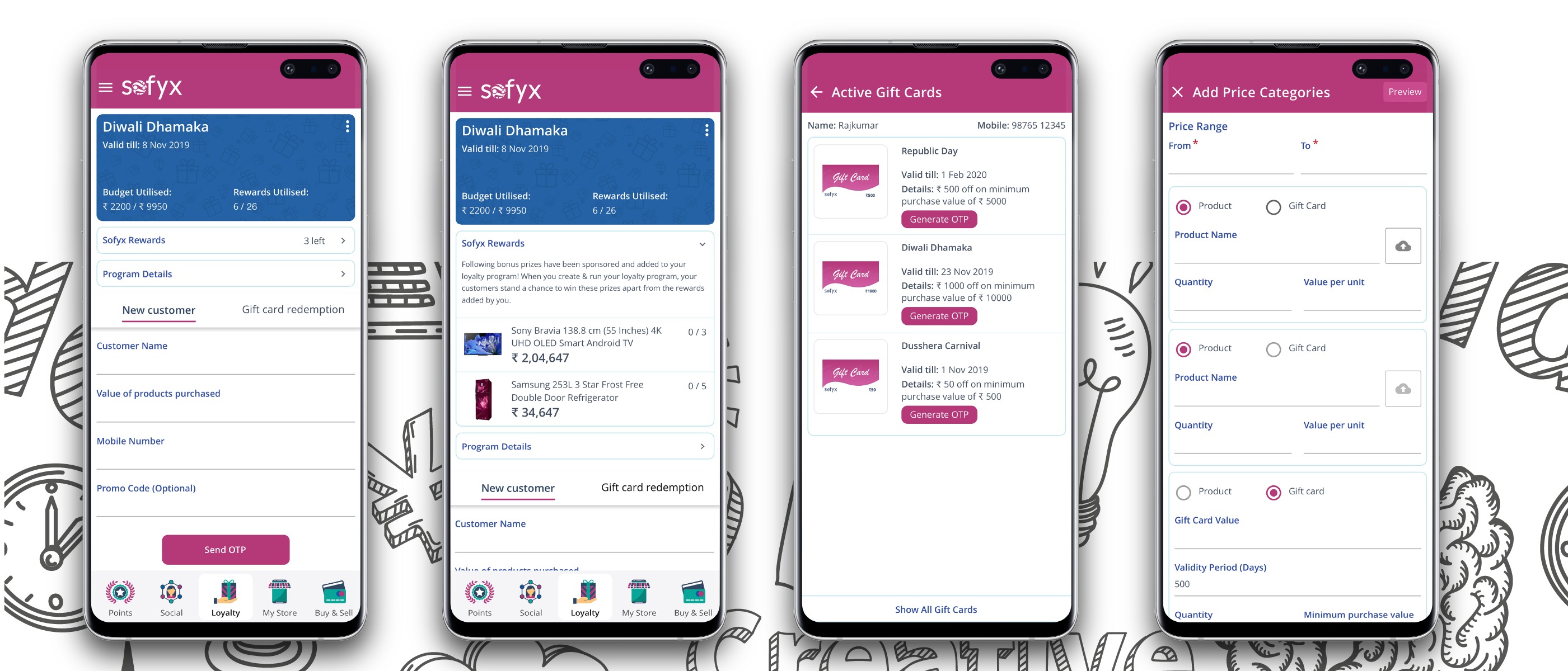
After the successful launch of MVP, gathering the user feedback based on usability was an important and learning about the user behavioural while using the app.
After interviewing few retailers, we were able to conclude on the following.
- Improve readability
- Tagging of gift cards to keep track in the ePOS
- Medium to target bulk users with offers during certain periods
- Staff delegation and management tool
After gathering feedback from users via. Different means (in person interviews and surveys ) . We understood the requirements and pain points still faced by the retailers. As a result we embraced the feedback and focused on each specific pain point targeted for phase 2 and improved on it.
- Improved Layout and readability of content
- Unique code added to each gift card for future tracking
- Introduced Bulk and Instant gift cards as new functionalities
- Introduced Reports
- Introduced Staff Management Module
We changed the layout of how the content is visible in the application, increased spacings and changed the body text color, which upon feedback accounts for improved readability.
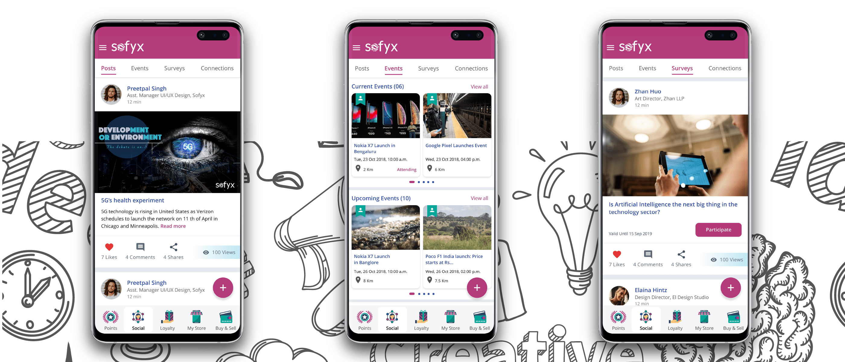
We revamped the design of loyalty to make it visually more impressive alongside introducing new functionalities of bulk and instant gift card, reports of loyalty data. Now Retailers can issue bulk gift cards to their customer base to keep them engaged and prompt them to buy their next smartphone/any other electronic from their store.
Introduced Reports, which gives them the brief overview of how the loyalty transactions have occurred over a period of time. A extend validity feature has also been added allowing retailer to extend the gift card validity that have expired.
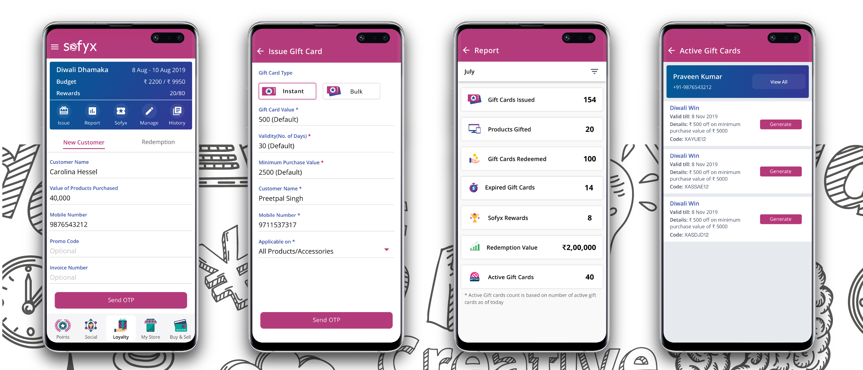
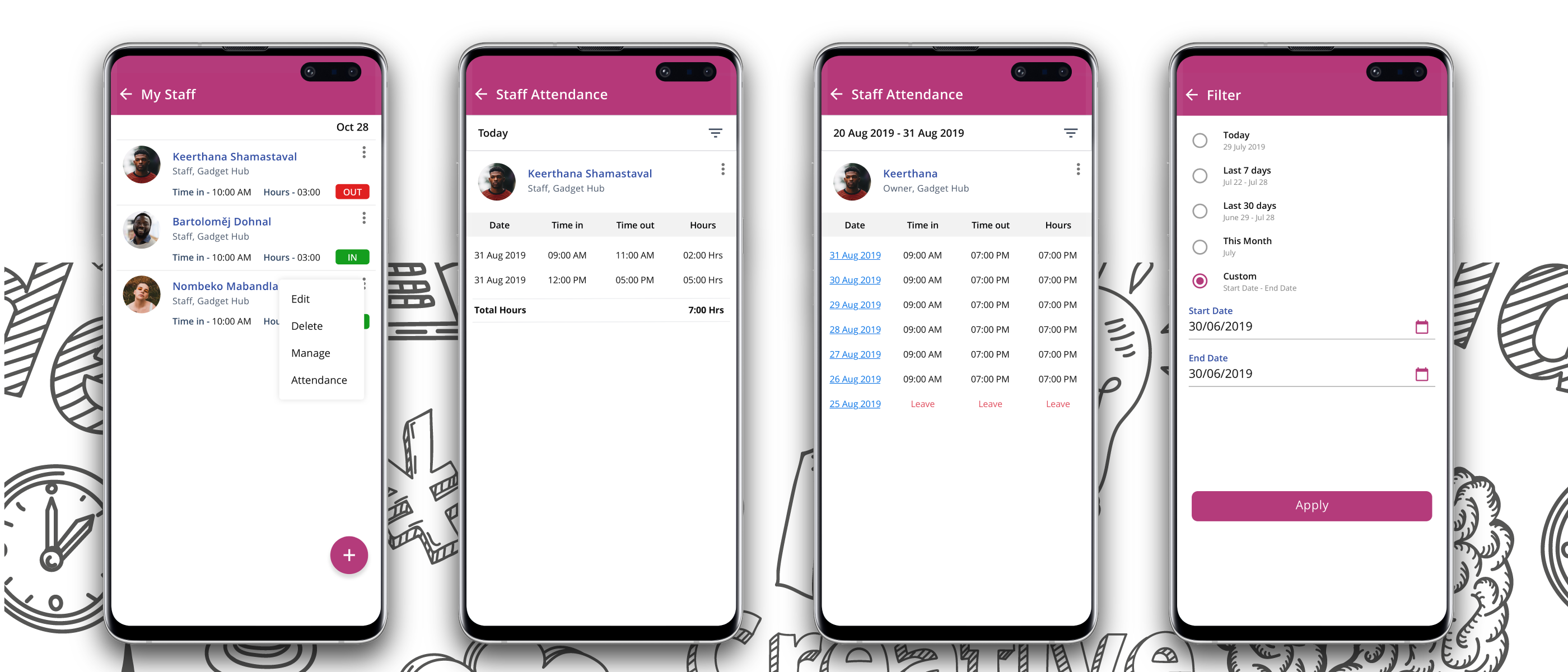
An average retail store has 4-5 staff employees who are the prime point of contact for the customers. They need to be equipped with the loyalty functionality. Loyalty by default not available to staff/consumers created a chaos by the arise. Of need to do transaction for two customers at once. Staff management allows the retail owner to delegate permissions to the staff (Use, Edit, Create Loyalty) rights for modules simplifies how the loyalty transaction is done at a faster rate. Based on the permissions given the respectiv staff member can issue/redeem the gift card.
